I can’t really say that I’m a huge fan of Yun Kouga’s comics. Earthian (Blu) was one of the comics that cemented my opinion that love stories between angels are relentlessly dull, and Loveless (Tokyopop) struck me as too melodramatic and confusing. I do find her art lovely in an odd way, so I keep trying.
I might have liked Crown of Love (Viz), a tale of romantically entangled pop idols, but there’s an obstacle. The font choices don’t make any sense to me.
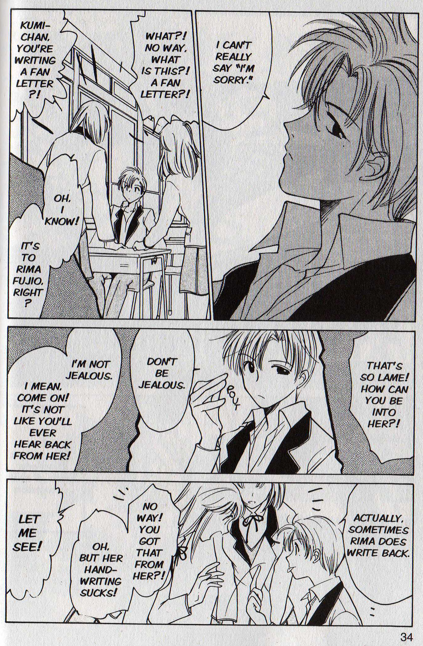
As you can see in the image above, all of the dialogue is printed in upper-case italics. Internal monologues and asides use sentence-case italics. There’s no distinction between present-moment font choices and flashback font choices, so it can be a little confusing to determine when the story shifts to explore past events.
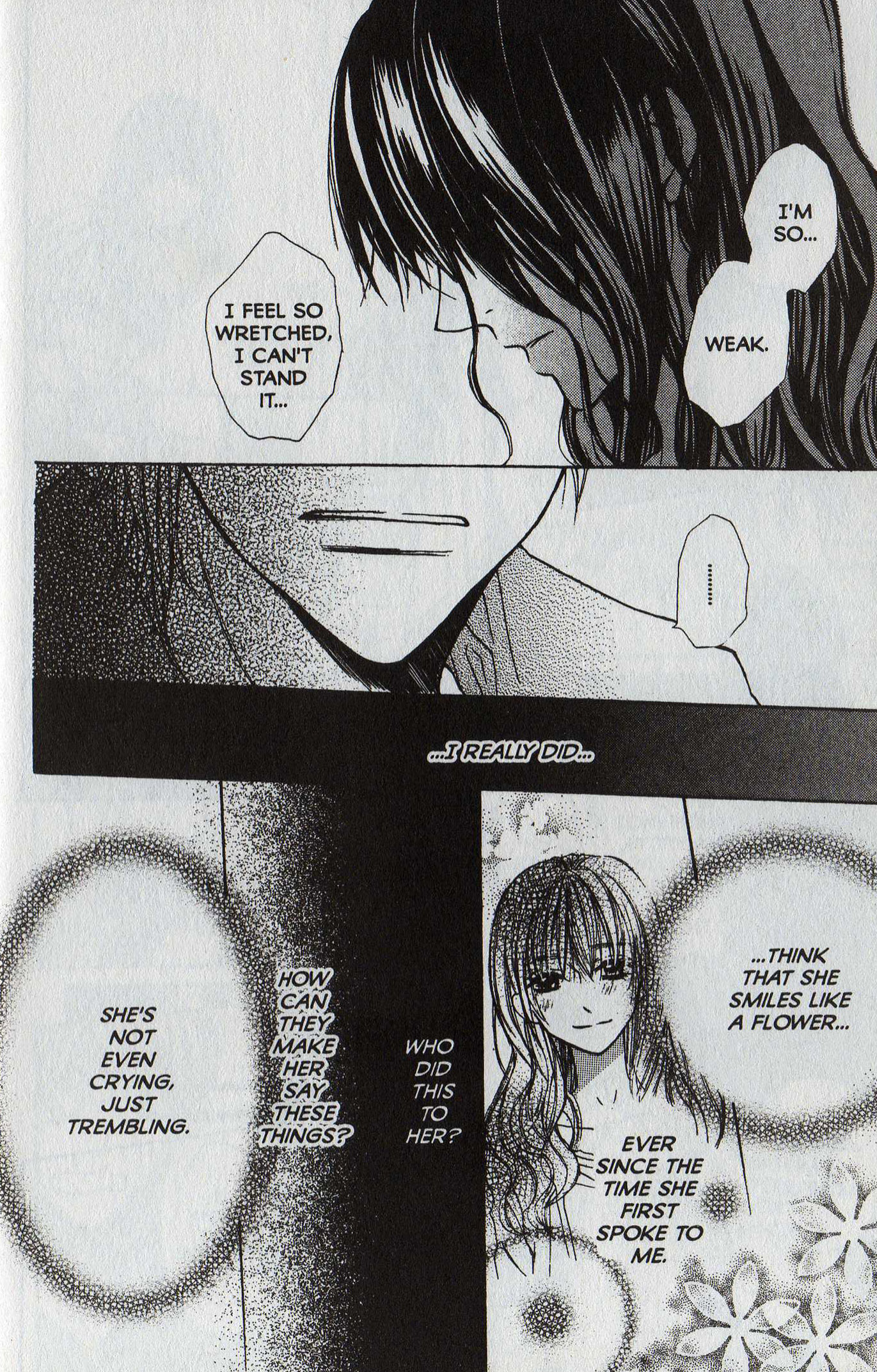
So my biggest issue with Crown of Love is with the way the words are presented. In my experience, upper-case italics are the font of meaningful flashbacks. Italicized text seems best applied to either shouting or internal musings as opposed to run-of-the-mill dialogue. So the consistent use of upper-case italics puts too much import on moments that should read as breezy and conversational. For contrast, here’s a page from the third volume of Ken Saito’s The Name of the Flower (CMX) that I think uses varied lettering extremely well:
Gradations of emotion seem important in Crown of Love, as the story shifts from classroom banter to industry scheming to intense and sudden feelings of romance. But the lettering bleeds the dialogue of visual nuance. It renders it in monotone. You can read it into the dialogue, but, frankly, there’s not that much nuance to be mined, and it seems like an awful lot of work to invest in a fairly slight outing.
There is promise here. Kouga’s illustrations are as attractive as always, and they’re cleaner and clearer than I remember them being in other titles. I like the agent character, Ikeshiba, who uses his charges’ intense emotions to get his way and move them forward in their careers. He’s so forthright in his manipulation, which is refreshing in contrast to the scheming, capricious old pervs agents often are in idol stories. And Kumi, the boy Ikeshiba is trying to sign by dangling a female starlet in front of him, has a domestic situation that’s grippingly unpleasant.
But the sameness of the lettering, its artificial, often misplaced urgency, flattens so many of the little peaks and valleys that could have been more meaningful. Dave (Comics-and-More) Ferraro notes that “Equal weight is put on everything as the book progresses,” though he doesn’t specifically mention the lettering. So it’s entirely possible that I’m the only person who has this problem, which suggests that I’m nitpicking. Here are a couple of links to reviews by other people:
There’s always the possibility that my deeply ingrained association of italicized all-caps comes from another source: