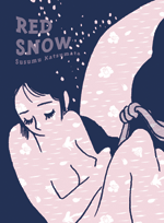
This week’s Flipped takes a look at a late but deserving entry into the list of possible best books of 2009, Susumu Katsumata’s Red Snow from Drawn & Quarterly. While pulling together illustrations for the column, I noticed that the cover design had changed rather drastically from solicitation to finished product.
Here’s the solicitation version:
And here’s the final:
I much prefer the final version. It’s much more in keeping with the content, and I love that it has an almost woodcut quality. The earlier version seems rather generic and lacks the earthiness that makes the stories so interesting. The first version is also sexy in an almost pandering way, I think, and it strikes me as sort of a bait-and-switch. Going in a different direction was a very good choice.
Just out of curiosity, I wondered what other versions of the book looked like. Here’s the Japanese version collected by Seirinkogeisha:
It’s nice, but it strikes me as a little delicate. It’s more in keeping with the content, but, again, it doesn’t have the grounded quality of the stories. Here’s the French version, published by Editions Cornélius:
It’s attractive in a bandes dessinées kind of way, though I still don’t find it as striking as the D&Q version. I know (or think) there’s a Korean version out there, but I’m not having any luck finding an image of the cover. I’d love to get a look at it, so if you have more success than I do, send me a link. And let me know which one you like best.


